

Voting is closed.
RhannyStatic
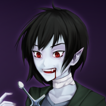
A simple yet effective introduction! We get a feel for how Mono was and how he acts now that he has regained his sanity. It seems he still has quite a bit to work through, as people have yet to trust him after all the pain and destruction that befell his home. Perhaps one day he can return...
On that note, the presentation...Not gonna lie, probably don't use those screentones, or set them to a smaller pixel size, as the patterns cause some of the scenes and colors to blur together. Plain old greyscale would've worked much better for the aesthetic you were going for.
All in all, I can see you're improving the plotline quite a bit, the presentation just needs a little work!
Rivana
This is an improvement from your previous entry for sure! We got more context on Mono's thoughts and his situation. The monochromatic theme also suits the comic well, though maybe next time you can experiment with reducing the screen tones to parts that are to be shaded. Variation of the widths of the line weights/lineart is also a fun thing to experiment with in monochromatic comics like these. You can try putting thicker lineart to things that should be shaded/in shadow or thicker lineart to the subjects/items in the foreground (I am not an expert in inking, it's a thing I am still studying too so I recommend looking up tutorials if you're so inclined). This is an easy way to add depth and dimension to your art without going the full-on rendering route.
I also noticed that your lettering and speech bubbles have improved drastically as well so huge props to that!
Ninja
Nice job on this. The story is interesting and I am intrigued as to where you are going to go with all of these characters in the future. I think one thing you can improve on is the size of the screen tones that you are using. the one that you have for this comic is way too big and it actually hurt my eyes when I was reading it. if you find a smaller one it will get the same effect that you want and will be much easier to read and would be easier on the eyes. on top of that it would help showcase the art instead of fighting with it as it is right now. Hope to see more from you in the future, and excited to see your growth. Good Job
Labu
wow an entry!
Comment posted: December 27th, 2022 at 11:08 PM