
Voting is closed.

Piñata
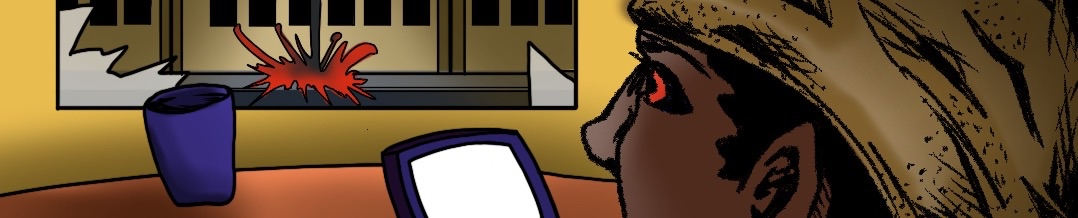
Glad to see comic work coming from you and a brand spanking new character- to say nothing of how inspired you were by the latest tournament you decided to give a bit of a nod to one of the rounds by giving us a peek as to what may go on after the dust has settled after a contract killing.
I will confess, I had to do a double take as I was surprised this was just one page. I may be alone in this, but this felt like your introduction should give us a look as to who your character is, and what they're about. I feel this single page plunked us into the middle of a conversation I as a reader didn't have context for and a character I don't quite know what they're about. I know we have character profile pages, but its always a good rule of thumb to ensure your comic pages can stand alone and tell us what we may need to know without supplementary content.
Still, your coloring really makes your inks pop- I'd recommend finding your light source panel to panel, so you have a direction to your light and shadow.

Eric
A comic that interacts with the world around it and our on-going tournaments is very rare on here currently, so hopefully you start some trendsetting. It's great to see Jason out and about. He has a fun design and a really out-there kind of vibe. While the engagement with Elba was neat, it was fairly short, but naturally this was a small vignette, not a massive thing. You were even encouraged to pop it up here so it'd be saved for credit. In the future, if you do something like this, it'd be good to have it more substantial than a single page since that makes it a little harder for your fellow users to drop reviews for it, but for what it's worth it was an enjoyable little read. Your main issue is the flow of your speech bubbles. You have a lot of space that's not exactly used effectively and the colored bubbles are so clean compared to your line-work. Not that you have to make something that's got the exact same grit as your lines, but it would help a lot. All in all, this is a nice little comic - hopefully we'll get to see a big show next time! Good work!

InkySlime
Jeda-Teq! It's nice to see a comic for Jason!
The perspective you used in the first and fifth panel looks really nice and well set up.
You've got a really dynamic style going on here!
Your Layout feels a little cramped, and the different visual elements become a little hard to distinguish from one another, or could use more breathing room. ( the first panel made larger or a little wider,with more emphasis on the background, would have worked as an effective establishing shot!) A lot of the world bubbles look either tightly squeezed in, or given way too much room.
I would also recommend a font like Anime Ace (a free Blambots font). I think it would compliment the look for your comic that you are going for more then the one you are currently using.
The one you are currently using, while easy to read,looks more appropriate for a text book, and looks flat and lacks a dynamic emphasis on what is being said. Another font like Anime Ace or Crime fighter (another free blambots font) would compliment the style you're going for more, and "looks"more like dialogue. I recommend giving those a try for your next comic!
Story wise, admittedly I'm not sure what is meant to be happening here, beyond them meeting. I feel like another page or two to explain the situation would be beneficial, we aren't told what "the cleaner" role is in relation to the situation,and it feels like we are missing part of a conversation between the two of them before the last panel. Is she walking away from him, are they squaring up to fight? It kind of just, ends.
I think a few more pages to let the story breath and allow you more leeway with your panel spacing would be something to keep in mind for your next comic!
Thank you so much for sharing your work with us!