Voting is closed.

Ninja
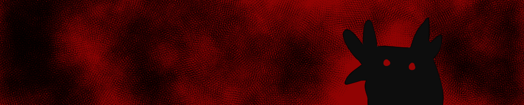
Page 2 is the highlight for me here, I really like that little 3 panel breakup with Krookis in the shadows. It's a very very nice angle and the art is a standout there. I do wish the rest of the comic was closer in style to that section. The inclusion of the spot blacks was really nice even if it wasn't a lot. On reread I was missing those spot blacks on the other pages. I will say, page 3 completely loses me, I don't really understand it and it doesn't seem like it adds to the story while it being drawn completely different from the rest of the comic. I do think you could have left the page out and the comic as a whole would have worked better. In the future I would also pay more attention to your opponents characters. Dez is written well and is very Dez like, but I don't really see the opponents characters here, Krookis for example can only mimic other birds words, which you could have easily done with Dez having such a personality and their own way of talking. I would just watch out for that in the future as it would make your comics better.
Ninja
Very interesting style you have here. I would be veryyyy interested in seeing a full comic in that lineless style that you use in the first page, that's really interesting and could be a really cool comic if done in full. The sketchy style of the rest of your lines does fit the atmosphere and vibe of the comic, espeically in the darker sections but not as much as in the comedy ending. In terms of the art though there is one section I would look out for, with the sketchier lines. During the red section on the bottom of page 6 it get's a little harder to full tell what's going on and readability in those panels drops. You'll want to use a different tone of red in that section to just break up colours, like if the background was a darker shade of red, and the birds had different shades to easily differentiate the two. I would also just watch out, I don't really see a scar given in this. I would just make sure that you do read the rules to the tournaments the next time as this is a scar tournament and it was a requirement for the round. But all in all very nice work on this, would love to see what you can do with a bit more time. Great job!
Ninja
PIZZAA MANNNNNNNNNNNN.
This might be one of my favourite comics of yours. I absolutely ADORE the spy vs spy energy you've brought into this. It's not something I thought we would have gotten but god damn am I happy that we did. My only real want from this is wanting to see more of Krookis but I am happy that your opponents took as much of a spotlight as they did. There is so much personality in your art, practically every expression is at it's peak. I would legit grab like 3-4 of those expressions to add as emotes that how good they are. Fantastic job!
Mintytree
I love the gag aspect of this comic, the interaction are funny and the set ups are clear: I especially like the switch ups/misdirections (picking up a stick of dynamite by accident, flying into a mural). I like to concept for a 1v1v1 match up (the last two pages would be my personal picks!) but I wish there'd be an even amount for each bird, which isn't the case here. I also feel like the "scar" aspect is clearer in the last two, but the personalities of all the birds come through really well in all of them!
Mintytree
Bird Wars international..... I love the black shading and limited red, everything is very clear and emphasized well! Seeing a fight that isn't necessarily connected to the war itself but more of a natural interaction. I especially like the composition of page 2, with Krookis' shadow moving and Dez's cut drawing Wallflower's attention.
I think the only things of note is that Krookis' scar is slightly hard to understand at first glance, since it's not clear that the knife actually cuts him, and it's slightly confusing where exactly the interaction takes place, I can't tell what the area/place Dez went into is, but I feel like thats a minor aspect in the grand scheme of the comic since the set up and interaction are clear and entertaining.
Mintytree
I love the atmosphere and the shading tones here, it made the comic feel really tense and heavy, with the intense red and night time-y setting.
I think the scars in your comic are a little unclear, I can see that Dez got a literal scar, slightly hard to see at first, but I can't tell what Krookis got. I think having a clear panel where the scar is highlighted or otherwise emphasized more apparently (Dez's scar was amongst a fight montage, and then shown in an entirely red panel which made it a little hard to tell) would sell the scars more.
The signs on page 4 are slightly unclear for me, whether they're something in the same space as Sez and Wallflower, or something Wallflower saw previously. Aside from that, the corn maze aspect is also a little lost without the presence of obvious corn or corn stalks, as the scene feels more forest-y.
Otherwise, I really like your usage of mid and close shots, Wallflower is a very emotive character!

TheRebelSpy
You started off very strong with the blocks of color transitioning into half-tones, and then to solid colors while Krookis was around. It gave me a sense of suspense! In general, you did really well showing the tension between the characters. You have a few formatting errors and typos where the text is too big for a panel or speech bubble; things that would benefit from one last editing pass. I wasn't entirely sure what the scars for your opponents were. In any case, nice job and I hope you caught up on your sleep.
TheRebelSpy
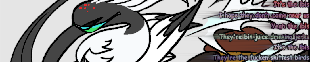
I love the panel compositions, especially when Krookis was spying on Dez. You make them appropriately sneaky. Generally I like how your style lends itself well to how dynamic and expressive all the characters are. The ms paint-looking rainbow font interlude is aces! I wasn't entirely clear on what scar you gave Krookis in the end, though the fight was good. I really dig how you commit to this being BIN chicken. PLANET BIN CHICKEN!!!! Utter garbage (compliment).
TheRebelSpy
The comical scars you gave your opponents were very funny, and I like how expressive your depictions of all of them are. Looney toons painted wall impact was great. You really center Dez - I would have liked to see more of Krookis generally, and for Krookis and Wallflower to interact. Having a series of mini comics is nice but it made the intended scars a bit unclear. Krookis is such a cute blobby design, I hope you do more with them in the future.

InkySlime
I really liked doing singular strips for an approach! I thought that was a really neat way to approach a 3 way battle!
I also thought that each of the gag's were pretty funny! Your expressions with the bird characters where also really well done. You did a good job of Pulling off cartoony, exaggerated expressions without losing clarity on a bird character.
Overall really fun! I thought you did a good job with this.Thanks for the read!
InkySlime
This was a fun read! I think you did a really nice job of weaving everyone together!
The layouts where nice,everything flowed easily from panel to panel and I really liked your use of spot black in this. with the grey it looked very slick!
The only thing I would note other wise is some of the balloon placement, Like page 4 panel two,I got a bit lost on the reading order. But it's a pretty minor for an overall very nice comic.
well done!
InkySlime
Very ambitious start!
I liked the tone you were setting, and setting up the narrative.
I think you used color effectively in setting up the intensity of the scene. The red felt really abrasive and added to the moment a lot. it was a good transition scene and you used the comics medium effectively there.
One thing in mind is to make sure you have clarity in each panel. One that stuck out to me was page 6 panel 8, You can't quiet make out the shapes or silhouette of action taking place, and with the text on top, it's hard to read it as someone being pinned down. Being mindful of bubble placement and making sure you give yourself enough room in the panel for reading clarity can help a lot with that! (or making a filled in silhouette to see if the action still reads without the detail is a good exercise to try if you are ever unsure!
otherwise thank you for read!
fuzzlekins
I loved the slapstick style that you went for here, very evocative of Tom and Jerry or Looney Tunes, with tons of gags at every corner. You managed to convey a lot of personality without needing any dialogue, which is impressive! Breaking the 3 way match into different 1v1s is a neat way to tackle it, but it's a shame I didn't get to see more of Krookis though, since he only featured in one of the scenarios.
fuzzlekins
I really liked how you drew all of the characters in this! Dez is very expressive and you draw him in great dynamic poses, so he's a delight to see in every panel. Having Krookis as pure black and blending in with the shadows of the first couple pages was really cool, and Wallflower is so cute but still fierce. The trippy page in the middle where Dez is passed out is funny and it was fun trying to read all of the text in the bg.
fuzzlekins
I think the start of the comic is really cool and moody. The shift to all red with Wallflower biting Dez was sick, though admittedly it was also a bit difficut to parse some of the panels in that segment with the limited colors and sketchy lines. Unfortunately, it feels like it ends a bit abruptly, so I'm not really sure what the conclusion is supposed to be, other than a cliffhanger of Wallflower being cornered? And while Dez got a scar via being bit, I don't know if Krookis really got affected in any way.

Doe
This comic was pretty goofy and fun; I liked the fun rivalry you set up between Dez and Wallflower, and all the pranks that resulted in some very fun scars. The only thing I would point out (aside from the messy lineart and strange perspective in page 3) is that krookis isn't really involved in the story at all? He only appears in the second page and doesn't really do much other than, almost eat dynamite. I think I would've like to see all three birds involved in the final page.
Dm me for a more detailed review, I'm rushing this one so much and I have 3 hours to type more
Doe
Cute comic! Simple but understandable story, the art was sketchy but decent.
I think my main issue with the art is that some panels are visibly scrunched down and pixelated (panel 2, page 6), as if you had drastically scaled down the art and then scaled it back up again. Additionally, you have a lot of "chicken scratch" in your lineart, as if you kept drawing over your lines over and over. Plus, there are very little backgrounds throughout the whole comic, which almost makes it seem like this takes place in the void.
plus, in terms of the scars: Dez' scar is barely visible and it seems like Krookis wasn't scarred at all in this comic.
Doe
The art for this comic was really dynamic and clean for the most part, with some things that clash with the overall visual style (page 4-6 seem to be lettered with MS Paint; I recognize that speech bubble tool).
I think my main issue is the writing. I wasn't sure what was going aside from "road rage inicident, Dez enters a place and gets attacked, then argues with Krookis and Wallflower" or why each character was doing what they were doing; Additionally, both Krookis and Wallflower feel like they were seriously mischaracterized (Wallflower is anti-social and shouldn't be talking as much as they do in this comic, Krookis speaks in a strangely formal and polite way that I don't think fits the whole "silly, yet scary bird" gist he has going on.)
I think you mostly need to work on how to "hook" your readers to your story, because so far there is nothing really there that would make people want to read more about Dez. Yeah he's a bird with an accent that likes fighting other birds, but what else is there? Is his temper comically short? Why? What does he know about the bird war? What even IS this war that is referenced in the comic? Who does Dez work for? Why does he work for them?
So many questions and so little answers given in the story.
Piñata
I love that this leaned into the Sunday comic funnies with the hijinks being episodic. Even the gags themselves felt pulled out of a Saturday morning cartoon which was really charming. It also allowed you to very cleverly deal with your two opponents separately in order to give them their appropriate spotlight. Humor is definitely your wheelhouse and was shown off to great effect here. I think considering the breakneck deadline its alot to ask to see your inks and elements tightened up as aspects began to get too lossey goosey, but whaddy'a gonna do
Piñata
Your stylization I think is standout in this round. Unexpected birds taking on more humanized airs and even jobs driving vans. The use of their feets to cellphone and drive tickled me alot. There was mention over the phone of a war being on, but I wished the landscape or environment reflected that such as a warzone, or a battle amidst the deliverymen.
You do a great job of finding a clever reason to introduce your opponents and showcase them in a creative way. LVOE the shadow movement of Krookis and the homing missile stab of that wing boil by wallflower. I think where you lost me is the dialogue. There is alot of slang and banter that isn't universally known which left me at a loss as to what I was reading. Though to be honest, I think the event without dialogue standalone rather mightily.
Piñata
Love love that slowly creeping red tone as things start to get tense. It really ramps up the tension of the moment without having to do much heavy lifting. I also think Krookis was utilized in the best way- that's a scary looking bird! Having them just be a presence that make ol' Dez beat feet and abandon the confrontation makes a whole lotta sense. I think what threw me upon first read were the typos which changed the meaning of your messaging such as 'flight ol fight' or 'strange you till your dead'. I think your scribble comic at the end explains how fried you were by the end of this, so that's understandable, but it never hurts to have a pal proofread as pages tend to glaze over the longer we work on them.
PyrasTerran
So it was partly my fault that I didn't read the comic note and walked into this one so confused in trying to figure out what counted as a scar or not. Reading it again with clearer understanding, it's a clever way to have some fun looney tunes hijinxs in strip form while honoring the agreement and even giving your potential losing opponents some options if you move forward. The expressions are the most fun in these pages, you can practically heard the birds in each panel thanks to those
PyrasTerran
I wanted to like this one more cause the character artwork is just so fun to watch and things were going strong for the first half of the comic, but I had trouble understanding a bit of what was going on cause of our ibis' vernacular, which i'm sure is part of the joke, but by the end I had to re-read a couple times to really get what had happened (and Im still a little hazy on one of the scars). Still this was anything but boring and I'd love to see your work with other characters as well
PyrasTerran
I kind of wish this cornmaze had some more corn
There's an eeriness to the scenario that is definitely engaging, and the arrival of the scare crow and how you rendered it was pretty cool. But it looks like something happened by the end, double pages and some additional pages about writing the comics (I would say in the future that you would be better off without adding these kinds of pages to an unfinished work, I don't ever find them to be a net benefit to the product). It's a shame you had struggles by the end, but I hope you aren't discouraged and keep on comicking with us

Eric
You mentioned the Spy vs. Spy aspect in a chat previously and I think this was a great choice - it really made your comic super unique in terms of storytelling and entertainment. I would actually love to see you explore this style of comic again in the future - I'm a big fan of classic comics like this with gags. Feels like that's a rarity to see, especially around here! This was a lovely little comic! I want to battle Krookis once this is tournament is finished for you! Great work!
Eric
There's something to be said for the bird characters in this tournament that are more "aware" and less "animal" - to that end, Dez is both a fun design and fairly well represented in his characterization. He's a fun character, love the intensive Aussie vibes - makes for a lot of fun. As for the art, kudos to Paperhat, you did a great job with all of this within a week. There was a little roughness at the end, but the opening is terrific looking. I hope to see more from both of you soon! Great work!
Eric
This was a fun comic! Really love how ambitious you got with this, especially for a one weeker! Being a vampire finch is a really fun idea to play around with and so timely for the season, not just Bird Wars! You really did a solid job with an economical page construction, especially playing with tones and colors to help fill out your negative space instead of leaving it just a solid color. My main problems with your comic was one of clarity. I don't think I would have got 'corn maze' from the background and setting if it wasn't for the fact that you had that as the title. There's nothing wrong with being more overt for the viewer, even if it doesn't make sense for the corn in the maze to be open, showing some of that around would definitely help establish it. On top of that, I think I understood the story in general - but it was a little unclear, especially Krookis' entrance and purpose within the comic. However, all that being said - I did like a lot of it. The fight sequence between Wallflower and Dez and moving to that red was a great move. This was a good one and I can't wait to see what you do next and how you improve. Good work!
Mokuzuu
Ooh, a bit of fun in the rounds, as we all love! I loved the more comedic angle you took for the rounds, and expressions of the birds really did add a good, fun flair for that! The interactions with characters happened mostly individually, but they were all entertaining and unique nonetheless, and you depicted other characters really well. I do also personally like that you did balance the actions and consequences very nicely. Krookis little asshole-ness (I say affectionately) is usually punished as well, so as readers, the fights don’t feel too one-sided - which can be hard when using other people’s OCs!
Mokuzuu
Maybe minor, but since its a personal favorite in terms of anthropomorphic stories - I love those little details when you can see diversity in how animals might use human toold, so the round already got me hooked as I saw Dez using his talons like hands.
The paneling and art was great for the round too! The grays and blacks made it easy to spot characters, making reading pretty smooth. The story was interesting too, and it felt all the character’s personality did show and effect the story, which is always fun to read in OCT rounds!
Mokuzuu
Ooh, first, I love your art and how you colored the comic. Personally liked the smoke from the cigarette as it was a nice visual aspect, and then the change to red/black from page 6 was really cool too! The managed to depict Krookis was both scary and cute, which I thought was very nice!
The corn maze aspect felt unique and the characters felt well depicted as well, making a fun little story! Everyone felt like they had good, equal screen time and role in the story, which sometimes can be hard to juggle for OCTs.
Also unrelated, but I hope you got sleep oh god. . . The grind. . .