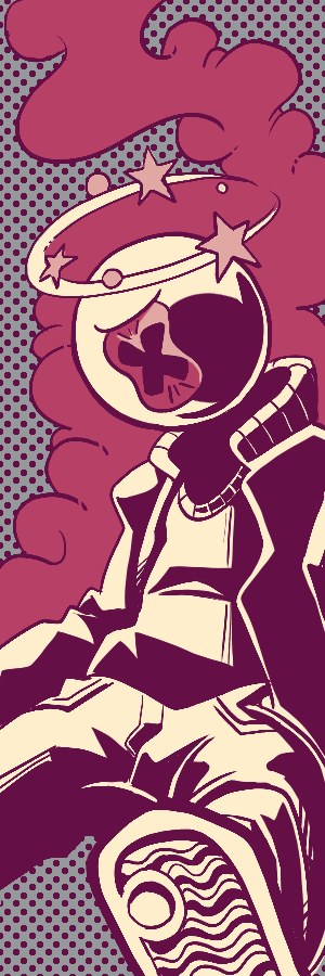
A simple lovely visit to the fine establishment known as Looters.
Voting is closed.
Looters seems to be the customer service horror setting of round one, and you've delivered a stellar comic from that pov.
I'm really vibing with the conceit of this comic of the restaurant as a place of horror juuuuust grounded enough to the actual service industry experience, calibrated to a degree that is exaggerated enough to feel properly purgatorial (a dinner rush requiring a four-year cleanup? dreadful) without breaking immersion. For a lot of readers I'm sure it will strike home and help heighten the high-stakes feeling of the situation these OCs find themselves in.
A big strength of your comic is how much you endear both OCs to the reader. They show a believable level of concern for one another, that the situation you've placed them facilitates tidily. Holly's sincere efforts to get Vanillian to flee Looter's and Vanillian's reciprocation in the form of standing up to the manager for Holly are great character beats for each of them.
Also one last not on the manager - a very good villain who I like more with each re-read. The fact that she manages to hold on to Vanillian as an unwilling new employee is actually quite haunting.
On the art front, you're doing a smashing job with your setting; you've got multiple terrific shots of the Looter's interior, from the wide-angle opening shot to my personal favorite, the panel of the cheering crowd silhouettes crowded around the bar and the screens (sports bar mixed with the shadows of cackling demons/ customers? I'm here for it.)
You're doing some fun things visually with the characters as well - I love Holly with her customer service smile on, just as much as I love her letting the facade drop. Seeing her get frazzle-haired and stressed in the same page as her "how-can-I help-you" smile is a GREAT contrast.
Very fun comic, EXCELLENT scene setting, and a stellar round one submission!
Short, sweet, and to the point; you gotta respect brevity! A one pager story is an admirable undertaking, and you've gotten a complete-feeling tale out of it.
On your lighting, I applaud your work on a darker, starlit environment - no easy task to tackle! You approach it from a couple different angles that work nicely - the BW characters with primarily brighter colors of course make a good contrast to the dark woods, and the lowing halo around Vanillian's silhouette in the last panel parses easily too.
It's understated, but your sky and woods coloring are quite nice as well - I like the boldness of the stars in the last panel contrasted with the subtler highlights in the nightsky and the foilage - the pink lights in the forest are also very appealing, and I like that you use the same pink to highlight Holly's halo and scream - pinning the pink as the color of action/ the lively color in the comic.
There is some nice perspective work at play here as well - Holly's big step and her getting launched into the stratosphere both make excellent use of a low-angle perspective which lends your comic some visual variety and bolsters the physical humor of her miss-step.
While I'd love to see more characterization of Vanillian in future comics, here or otherwise, I do enjoy the character notes you've communicated over the course of the page - a classic, well-proven cautious/ leroy jenkins contrast between your OC and Holly, but an enjoyable one nonetheless.
Welcome to Oculama, and kudos on a strong start!
Im actually SUPER FUCKING IMPRESSED that this is only SIX FUCKING PAGES! While i was reading and remembering the comic it certainly did NOT feel that way and actually felt like it had a lot going on, so that was a fun feeling!
Its great to see you back into comics, this one was. BASICALLY EVERYTHING I COULD'VE ASKED FOR OUT OF A BATTLE BABES COMIC??? The humor, and raunchy irreverance is what i would have wanted out of B4. The interactions are everything to me and i love that ending. Also thanks for using my stage! It was a joy, hope to see more of The Holly!
The art in this is solid but with one page unfortunately there's not much i feel i can say, i will compliment - at least - that the comic's art is very solid and you usually do a great job capturing the vibe of a location! The colors and texture you have in the comic is great, so the location that the comic takes place in is very well captured. Other than that i could have only wished for more from the comic! Great to see your first bout on Oculama and i hope to see Vanillian again soon! Goopty!
Welcome to the site! I really liked this comic! Holly's story and first round here instantly were endearing and I love how you tied everything in with your location. Probably the best use of utilizing the location that I've seen! You have some decent little action and some fun jokes overall. Your backgrounds were okay but I really hope to see you try to push it harder in the upcoming rounds. This comic ended up being a bit of a surprise for me so I really hope to see you do more of this in the future! Regardless of whether Holly goes all the way or not, I hope you do more comics here! This was pretty great, good work!
I have been waiting to see a zeedikay comic on here for a while! This one was cute and fun, nothing wrong with just a little gag comic. I like Vanillian, her design is fun and she's a little weirdo. The color choices were really nice, although in the future you should consider working with your hues so they're a little more visible and clear. Some of the greens and details get lost due to the color choices and I'm not sure coloring your characters would have had them clear necessarily. On the whole, I really hope to see you do more on here soon. Glad to see you on here, hope to see you do more!
Holy shit this is so funny. Every page is a lovely surprise, the punchlines are clever and unexpected, the art is so cute and friendly. This comic is so pleasant for being so morbid, Vanillian and Holly are such good characters. It's common courtesy to criticize comics, but both of these achieve their goals so perfectly I find it hard to say anything that would improve it. Even the simple values help block the scene so efficiently, this comic feels FULL with a very sparse amount of details. Super surprising, but in retrospect what else could it have done? Absolutely lovely.
You can read both reviews! So this feels repetitive. But there's so much that's still true! It's creative, it's oozing with charm, it's an absolute blast to read! The color in this comic is a great difference, using the swathes of night and little sparkles of color to make a scene that feels mystical near instantly. the line quality gives everything a traditional texture to it, despite being obviously digital. It's so effective at setting the characters up in two panels, you want to know more about them but you have every foundation DONE so effectively. Absolutely enchanting work here.
Glad to see this little bug coming in with style during round 1. I dig the restaurant concept and tongue in cheek title. Looters prompted a chuckle. Holly definitely looks like someone who'd work there and the hijinks that ensued to get her tossed out were pretty clever. You even managed a third antagonist and bit of a history lesson of Looters which was fun. You definitely didn't skimp on the design of the place by way of interior. I like that it didn't look like a restaurant at all when it came down to it- more like a mad scientists laboratory. I believe you gave such a spotlight to Holly and letting us get to know her, but I was left wanting for more Vanillian. The balance definitely isn't easy by way of featuring, but I think that is something that can come in time. All in all this was a fun read.
A short and sweet gag. So glad to hear you felt in the zone while you were at it :D The dynamic angles of Holly taking that big step before Team Rocketing out into outer space was a funny bit of physical humor. Granted, its one page, but its clear you had alot of fun making it. I do suspect this will leave readers wanting- at least it is on my end as we don't really get a good look at Vanillian. I don't mean visually, but more who they are as a character by way of aspirations, wants and motivation. Definitely something to keep in mind for future comics tho
great first showing! i love the excellent usage of the chosen setting and holly is a fast fav with her jokes and expressions! " I DONT WANNA BE OLD!" lol like i was saying you did a fantastic job with world building more on the tourney just off the looters location and the tyrant manager boss was a great conflict to throw in the mix for the two OC's couple that with how much detail and slapstick you added toward the end makes this a perfect entry to showcase your style and humor! I cant wait to see more of your stuff
A great page with a short and sweet windup and pay of lol I am sad we didnt get to see more of the two interact but I very much enjoyed the time the two shared on screen! I think mostly my only criticism is we didnt get much of a setup for them though her getting rocket propelled off a slip is very funny and after seeing both entries ironically very accurate lol. I think I would hve liked to see more of vanilian though as she has such a good character story and premises so hopefully more of her gets used in the next round!


InkySlime
Ziyanthus: what HOOT! I got a good chuckle out of your comic, it was a lot of fun!
Zeedikay: I really liked the color palette choice you did for this page!
Comment posted: October 21st, 2024 at 9:11 PM
Prometheus
WELCOME TO BIG MAMA'S INCORPORATED
Comment posted: October 3rd, 2024 at 6:43 PM