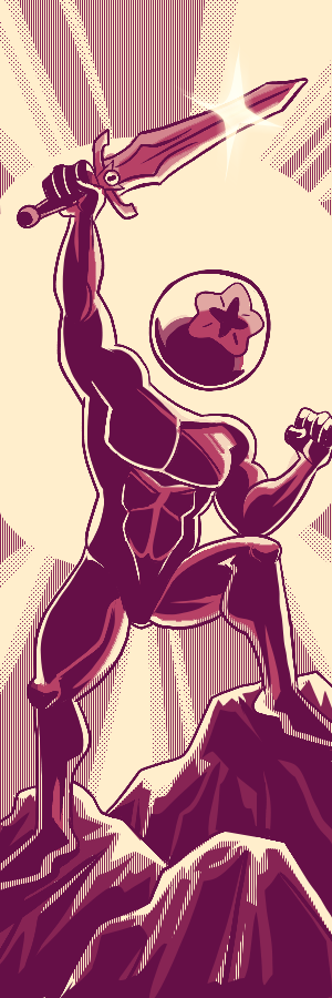
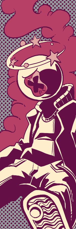
How shall they get back on their way?
Voting is closed.
A space-bounty story? Sign me the heck up. I am into all the twists and turns of this story, and the shifts from static location to trains and spaceships is a nice ride. The layouts for some of the panels and the action intended is intriguing. You both have pretty distinct styles, and I'd love to see what comes of more pages where the both of you work on top of the other. I'm especially a fan of the spaceship designs in this comic - I'm a sucker for unconventionally shaped vehicles, and both sets of OCs had odd enough shapes to capture my interest and attention :)
I start to run into some issues around page 5-6 of this comic parsing what's actually going down. I can get broad strokes, but neither the art nor the dialogue is particularly easy to parse as far as getting my bearings is concerned. There's an interesting tale of reversal and underhandedness being told here, but it took me about 4 read-throughs to fully piece it together.
That said, the story that *is* here is a neat one, and it has enough genuinely humorous moments ("we knighted each other" Lmaoooooo) that make it a worthwhile tale. I'm a sucker for enemies finding a common ground and teaming up by story's end, and you executed that quite nicely. Sif and Eyesore make for a very compelling duo, and I'd like to see more of what the two of you as creators can do with them in the comics to come.
This is very nicely paced for the opening salvo of the tournament, giving us a good read on both the occupations and personalities of your OCs, and resolving an initial conflict in a way that is brisk, but leaves open to the reader's imagination a lot of tantalizing possibilities of what might come next for your bounty knights. Props for getting a lot across in very few pages without hitting the reader over the head with an excess of exposition.
My biggest issue with the comic would be that it feels a bit dismissive of your opponent's OCs to the point of feeling mean-spirited, especially when we get to the end with your knights posing alongside their unconscious forms and then leaving one of them on the ground. It might feel less abrasive if either of your opponents had been a bit more fleshed out in the preceding pages, or if the encounter had not read as so overwhelmingly one-sided, but as it is Sif and Eyesore come across as two background characters who got their lights punched out pretty trivially.
Art-wise there's a lot to be impressed with here. You've included a nice balance of tight and far shots that keep the action sequences engaging, and there's some excellent angles chosen for shots that might otherwise be static dialogue. The action throughout is very readable, and you've struck a balance of detail to streamlining that makes parsing throughout the comic a breeze. Excited to see where these two go next ;)
The incompleteness of Johann Hawk's parts really left this comic feeling like it could use a little bit more time in the oven, with the single page being done by what i can only assume to be ArtistColors being smacked right in the middle of it all, i often found myself confused and lost within the empty lines of the comic. I still appreciate the characterizations of the Knights, with them still being a joy to see each time they show up.
With the comic being in the state it is i wish there was a bit more for me to grasp, but still, you pulled through on a comic regardless!
Goddamn what a fucking dynamite pairing this was, the sheer amount of capital C 'CHARACTER' on these two will forever be near and dear to my heart strings. Absolutely adore the ending with them essentially capturing the other two opponent characters for fucking ransom and selling them off, thats such a kicker and actually gives ideas as to where the characters can go from here should they continue making comics!
The action in this being as good as it is, and as readable and easy to follow as it is really pulls the comic together, fucking COMBO ATTACKS??? This is literally everything you could want out of having a silly duo character and it DELIVERS. NO NOTES
I think you guys came up with a really interesting and ambitious premise for this battle!
Admittedly though, I had a bit of trouble keeping up with the plot and following along. Somethings weren't super clear to me, I understood they were hunting down bounties, but beyond that I'm not sure what was taking place. Some Panels were hard to make out visually and I wasn't able to grab more context from the dialogue as well at times.
I did like the designs of all the characters in the comic though, and I think the color choices used through out were nice as well!
Thank you both for making the comic and I look forward to see what ya'll do next!
Right off the bat I feel like you both work together really well!
First off I liked the use of grey and limited use of color through out the comic here. I think those elements where utilized very well, both visually and for story telling. I also enjoyed you playing with the panel structure more towards the end. That was a fun touch!
I would like to see it more cleaned up, to help with the overall consistency with the comic and I think a comic font more suited to comics would be a benefit, something that compliments your art work more. The default font brings you out of the story a little bit and looks a bit jarring.
Overall solid work you guys, I look forward to reading more!
As collaborators on one comic, my usual M.O on that type of format is for the duo to play to one another's strengths. Like for example, Artistcolors doing the pencils for johannhawk to ink and building the pages up to be cohesive as a whole. It seems both of you strictly kept to your own pages, which while totally something you can do, made the comic as a whole read a bit disjointed to me. I'd love to see more of a finalized look from your pages, Johannhawk as I can't tell if this is simply thumbnails/roughs or not. As this is the case, I find myself having to re-read sections for dialogue context as visually I can't tell what I'm seeing. I certainly hope much was learned during this collaboration as comics in general tends to be a group effort, especially in the industry. Definitely much to learn when its not just you! :D
Such a fun play on your page composition and paneling. Things like Bootleg taking a seat on the panel right below them is such a whimsical touch and great use of the page space. Your inks carry a clarity and a range of motion which made for interesting action scenes, so it was nice to see this scuffle build to something explosive. Its interesting to see these olden timey looking knights speaking with such modern terms and mannerisms- even going so far as to take a selfie upon victory.
You work with such a lovely thematic filigree in the first and latter halves of the comic I wish was used throughout. Ideally, to make this feel like one comic, it would've been nice to tie in some of the stylistic things each of you did in your own pages to every page overall so that it flows better. It's not a need to have ,but definitely would be a nice to have. Even so, lovely effort and thanks for giving us a rollicking good time!


LexiLopezi
GHUDFHISHGIHRKIFHRE MANLET (gender neutral) BOOTLEG STANDING ON THE CRATE. I'M DYING. I LOVE THIS. THE STRIPY BACKGROUND PERSONAL CHIVALRY PANEL. BUDDIES :D Bootleg would totally wear sunglasses over their helmet. "[LIE] HAPPY DOING BUSINESS WITH YOU" HYSTERICAL. Ohhhh so that was just to get access for a duel, clever.
Comment posted: June 4th, 2023 at 3:08 PM
Prometheus
LETS GO KNIGHT BRIGADE, KNIGHTS v FURRIES LETS GO
Comment posted: May 30th, 2023 at 8:49 PM
Piñata
Can't wait to see how this turns out. Best of luck to ya!
Comment posted: May 17th, 2023 at 1:40 PM