Voting is closed.
Who knew a gopher could have such beautiful daydreams?
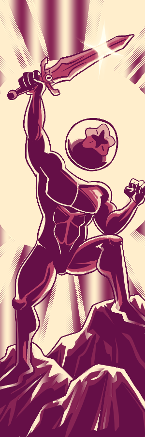
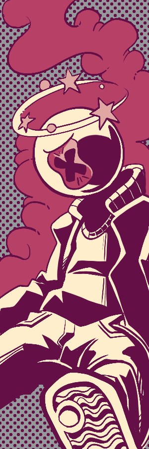
And I do mean beautiful; this is some lovely coloring for your R1 (not that I'd expect any less). The panels, even when done in greyscale, are never less than a treat, and elevate to stunning when the shit hits the fan (especial shout-outs to your coloring work on the cover, the sword-pull, and the snake's breath weapon. Visually, there's only one thing I feel like I'm missing, and that's more Alex, baby!
You've nailed the payoff for contrasting AG's greyscale everyday against the technicolor of the battle babe arena. The grinding frustration of her workplace and the hostile inconsideration of her coworkers really struck home, and it says something positive about your storytelling that a snap-back from a fantasy where she sacrifices her own life to a reality where she is fine feels like a gut-punch downer.
On top of that, it says something really compelling and heartbreaking that AG would throw herself into a sacrificial dive the moment she's free of her daily grind. There's an acknowledgement of the...well, maybe not fatalism, but desperation of escapism. How the imagination will accept any number of dangers in theory to the safety of the mundane here and now.
The fantasy section is brisk, but gives the reader a lot to chew on/ ponder (I appreciate the ambiguity of whether the BBBB is actually an event happening in the outside world or entirely a construct of AG's imagination). It does make me curious whether this comic would be an earnest endorsement of the tournament's canon-ocity, and, if it does, what structuring of it would involve a snake foe who is seemingly and proclaimedly separate from the babes (an environmental hazard for the first round? and external danger imposing itself on the tournament? The possibilities are many and exciting!)
And naturally, who doesn't love a solid Utena homage ;) ?
Solid stuff, start to finish; I think it's safe to say AG has won a lot of hearts in this OC community :)
VERY strong use of the restaurant setting in this comic. I'm a big fan of the genre of thriller where the protagonist has to use their wits to make their way through a situation where the laws of reality have gone hostile, and I love how you've married that up with the relatable horrors of being even remotely in the vicinity of working in the service industry.
It took me a read-through to comprehend that you'd interpreted AG's imagination angle as reality bending (originally I thought it was an environmental factor at play? honestly upon further reflection it still could be but I guess the punchline is still that, for the purposes of this fight, AG is a reality-bender), but it's an angle I really appreciate upon further re-reads. It makes her into quite the plausible threat while keeping her in her established lane, and sets Kloe up to shine with her counter-plan.
I want to linger on that counter-plan a moment because it does a lot of things I appreciate - it lets you as the writer and we as the readers sink our teeth further into both OCs' characters, for one. I get to see Kloe as the quick-thinking pseudo-bureaucrat who has developed a sense for de-escalating a situation where violence won't find purchase, and it shows us AG as a character with, yes, a strong imagination that lets her be a real physical threat, but also as someone who really just wants to experience nice things, and not nesc nice things revolving around conflict.
(Also love how you get Alex in on the action, both in the role of spooking a fellow small mammal, but also as a short-order cook working that fryer like a PRO.)
Art-wise, you've done some nice work with the character designs. AG is already a delightfully-conceived character visually, and giant AG is ten times the treat! Kloe is also looking very sharp in her Looter's getup, and I'm a big fan of how haunting you make the exterior of the restaurant look on the bookends (For a second I thought that big portal in the sky was Jojo's Void Heart~~~~)
VERY complete and VERY good although i will say i am very unfortunately not hit as hard by the climactic finale as i have not experienced Revolutionary Girl Utena. *Although,* even if the sword in the gopher moment wasn't as impactful as it could have been there isn't anything really holding the comic back barring some pacing issues leading up to the reference, i feel like it kinda rushes to get there
Although the ending with the Snap Back to Reality was really effective and i really love the solemn ending right back into the greyscale, thats good shit, i just wish that had more time to rest in the abruptness of the moment
ADALORE!! its fantastic to see you doing comics again and holy SHIT. This one knocked me on my ASS!! i fucking loved all the twists n turns this comic took, and how it so perfectly encapsulated what i wanted to see out of this tournament? Its fun, its irreverant, its got some great humor i loved every single part of it.
The characters were just fun and i wanted to see more of them, having The Gopher use her imagination to influence the world around her and lead to Kloe having to adapt to this new circumstance and acquiesce to her whims is just PEAK!!! AAA i love it welcome back to OCTs
Accountagopher we love you so. What a way to setup and take a character's themes home! The wistful haunting ennui, The colors elevate this comic, giving a stark contrast between the dreary office life and the lively fantasy dream of Accountagopher! The colors help the art take a strong "definitive" styling, where said colors along with the lines and shapes (while rough) work to clearly define objects in their panels, creating a very clean and easy to follow comic. All together it weaves into a strong narrative, dream and fantasy, with a fitting and contextually funny climax. While a perfect thesis for Accountagopher, Kloe maybe received a comparatively weak character exploration, but had a strong presence and role in the narrative.
An ambitious comic! A lot to setup for a large action scene featuring beloved goofball action. Adorable Accountagopher depiction, funny weasel counter, and a good setup showing Adalore working through how to deal with the lil fuzzball that is Accountagopher.
Contextually, I'm aware that Adalore ran into real-life issues complicating the creation of this comic. Art is beget from the circumstances of its creation, and that mixed with the ambition leads to the messy art of the comic, and maybe how the comic struggles at time to flow between its pages.
The comic does what it can to build its comedy action to an appropriately funny climax embracing the Looters setting. A use of the setting that was maybe expected from this tournament.
The usage of color in this is astounding. A tour de force, it borrows from Utena in such strong ways to become an overwhelming fantasy. There's a motion to the paneling and the pinks, a weight to the scene that absolutely shines through. This comes a lot from the cinematography, which keeps so close and small in the real world, but becomes so big and epic the second the fantasy begins that it feels like the entire world blossoms. Now you just need to draw more hands, and it all works out. A blast of romanticism, this is a comic.
This comic is such an odd little creature, I adore it. Both characters are so comedically strange, but the logic they follow is perfectly clear and never hard to follow. The timing of the jokes is always on point, so they hit particularly hard, and it feels like the entire world is just set up for this stage. The timing of the story itself was sometimes hard to follow, but the gags meant you never spent long confused or wondering the point. The paneling is a strong component of the comedic timing here, it's got a good compromise between a strict grid and freeform. It's lovely!
This was a good comic! I liked your story and I thought Accountagopher was a funny little weirdo. You have a real economy to your comics, which goes a long way. It looks quite good, but I really would like to see you push it more. I'd like to see you do more detail to your linework, stronger shadows, more careful rendering. For example, some fluffiness to Accountagopher or their hair would have been nice, same with a couple scales or maybe having stronger definition to hands. I can't wait to see you do more work. This was another good comic from you, nice work.
This was a fun little story! I thought you handled your opponent very nicely and used this location to great effect! While I would have liked a few more detailed backgrounds, I thought your character posing and the action involved were really fun! Same with the way you had Kloe deal with Accountagopher. The imagination running rampant and making them invulnerable illustrates a nice point that it doesn't really matter if your opponent is godlike, so long as you write it entertainingly enough, your character can win. Whether you're going to the next round or not, I want to see more comics with Kloe on here! Please do more! Great work!
This concept and character are so off the wall and unique I found myself much looking forward to seeing what you'd be doing with them for round 1. For someone known for color in their comics, I love that you still managed to portray the drudgery of office life before sliding into the brilliant kaleidoscope of accountagophers daydreams. Making this face off happen all in accountagophers head is so inspired. really love the creativity in this story idea-and the nod to one of my favorite old sapphic animes. The fact this sword isnt coming out of a princess but a gopher just adds to the hilarity XD Really great job on this. I cannot wait to see more.
Glad to see you on the other end of round 1! :D Your panel composition and design page to page is pretty interesting. I especially enjoy the imposing silhouette of accountagopher looming behind Kloe on page 5. If I can offer a suggestion, I'd recommend adding some SFX to your action. I think the scenes where Kloe is tossed about would pack more of a punch with a bit of onomatopoeia added in. It'd also be interesting to see the font/lettering design you'd get up to.
Its clear you had fun drawing your opponent, accoutnagophers expressions in this were utterly adorable. Definitely a charming first showing. Keep it up!


InkySlime
Ninja: I really liked what you did with the color scheme of this comic, and some of your best Page Layout work too! Just a fun story overall.
Adalore: What a fun comic, I really like how you tied everything together and the action was pretty great! the ending was cute too!
Comment posted: October 21st, 2024 at 8:57 PM
Prometheus
Judge for Infinity Chasm
THIS IS A TOP SHELF FUCKING MATCHUP BITCH LETS FUCKING GO
BABE!
BABE!!
BABE!!!
Comment posted: September 30th, 2024 at 11:24 PM