Voting is closed.
Your designs (both for the characters and the UFO) are really quite stellar. It's a great art style you have overall; I think the artwork could be a bit clearer in places, re: the environment and the action going on. It took me a bit to track that the puffy bits early on were trees, and then those seem to disappear from the pages entirely to become more of a desert valley? It helps to have the explanation of what was happening from the characters themselves towards the end, and it's a real high-octane conclusion, so I think a bit more focus on clarifying the layout of the panels will really help your ideas shine through!
This comic has a real surreal-made-mundane Hitchhiker's Guide vibe that I'm digging a lot; you're able to sell the location and the boredom the characters feel pretty effectively with minimal art (the lines of clocks were a good choice). Story wise, these two pages feel like they should be the intro to our characters going off to do something else, but I can appreciate limiting the comic to this one scene as an artistic choice. Maybe a bit more of a punchline for future comics. I'd also love to get more depth on the characters (yours and your opponent's) next go-around. Good work on the start overall, and keep at it!
I really like your style here, it's kind of like a woodcut drawing? Very intense and good for action! Everything felt really fast and whooshy in a good way! It feels like you put a lot of effort into making the poses and action feel good. I think the design of the alien ship was really cool.
I was a little confused by why Ray and Kathy were fighting the robots, and Kathy showing up felt a bit random?
The ending with them acknowledging they blew everything up was fun! I liked Kathy's unamused face on the last page too. I enjoyed the both of them just jumping into the action and doing combos together without hesitation.
I like the idea of a whole planet full of clocks that's just an art piece, that's really creative and a fun setting for a comic! It's cute that Ray and Kathy are just chilling out together as friends. The variety of clocks is really fun too.
I think it would help the clarity of your art if you looked up a few tutorials on how to fix the contrast of art after it's scanned, and/or inked over your pencils? It's a little hard to see what's going on. You might also want to add in text digitally so it's more clear and easy to read.
I really want to see what the clock planet's gift shop is like! I think you have a good sense of how to pace dialogue well in a comic, too.
Great lil action comic here Vortexz. I really loved the big anime team up blast, always fun to see characters fight together instead of against each other. I found a few readability issues in this. the second page the panel with the attack is kinda hard to comprehend cause there's a lot of greebling inside of the blast, and on the last page it's a little hard to read what Ray is saying. just bumping the font size up 1 and giving it a bit more space would make it easier to read. just some small stuff to improve your comics. other than that it was very well done, loved the mechanical greebling on Ray and just how thick your lines are. makes everything really pop. well done
Ok this is a fun comic. I've actually been having ideas to do something like this myself so I'm surprised someone else beat me to it. The hand lettering for the dialogue is good theres only a few words in which its harder to read so making sure that your comics are more readable in the future would be a real good improvement. I think it ended just a little too soon. the joke set up was a good one and i enjoyed it but i think it wouldve been real cute and funny if you continued it for one more panel and just showed the two of them in the gift shop looking at shitty snowglobes or something. It gives it a nice ending you know. It's good I enjoyed it.
VORTEXZ-
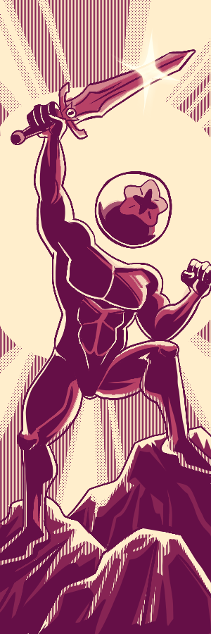
Upon first read, I couldn't help but notice your character Nosha was drawn in a really interesting way! It almost seems like you started with a black base and carved the details of the character via the negative space. The same could be said for the alien craft they battle, which I think is neat! The environment and outside elements aren't given the same treatment ,so it allows for the objects that need focus the ability to stand out.
Also your sound effects in a different language? Or foreign symbols was an intriguing move. I wanna guess Japanese, but a few of the characters I don't recognize. Either way, it makes for an artful delivery of SFX, but for a majority English audience, leaves us in the dark as to what sound we should be hearing here.
Either way, this was an interesting comic! In a way, its funny you and your opponent ended your tales in much the same way.
KURIYAMA-
This was actually pretty funny ,which I did not expect. XD I haven't decided if this was the characters breaking the fourth wall, or just naturally being that deadpan. Either way it was a pleasant delivery!
You have the raw materials of a comic here which is great! An 'establishing shot', details as to what the characters are dealing with and the two of them interacting. But there are a few elements that are missing that would really help out your process! I'd recommend giving your fellow Inaugural tourney members comic pages a looksee to give you some ideas on format and how to compose a page by way of paneling, word bubbles and what have you. I think infusing what you see and are inspired by will really help.
Vortexz - Really nice chunky inks you got here and Ray's armor really stood out with those inks. It's so cool to see those detail in his armor. Can't go wrong with the good ole team up to fight an alien evil robot hehe. I think the dialogue is a bit too exposition-y (for lack of better word) at the end though. It did give us insight on what happened but more of after the fact instead of clearly showing it via panels. Also, maybe try some word balloons next time. The rectangular dialogue boxes made me think they were being narrated at first and not spoken. Just a couple of take aways for next time! Good job on adding some grays to supplement the stark blacks! I think that balanced the artwork very well and gave it more depth. Can't wait to see more of Ray and Kathy's adventures together!
Xion, awwe I am kind of bummed you did not finish the comic but I understand that life happens! This is a nice chill comic about two strangers enjoying a tourist-y activity. It makes sense as I am sure there are plenty of things to see in the multiverse. I did get a hard time reading the text in some parts though and it would be cool if we actually got to see them fight someone together (or each other hehe). Hopefully your next comic will get to show us more of what you can do. I am definitely looking forward to it!
This comic has a lot of fun little quips between the characters but I am not sure I fully understand the story here a lot of it is a bit hard to make out on exactly what is happening I do appreciate that you are trying to do cool action scenes. I also feel you could use your opponent a bit more cause it feels like they just appear in the middle of your comic sequence but maybe there was an aspect I missed in your comic that explained it, but I did enjoy the little bit of team work they had.
I personally enjoy the masterful amount of depth that the individual panels are lent by the spacing between the characters in the foreground and the aspects of what little environmental storytelling is lent by the clocks on the wall really giving an aspect of less is more to the entire composition of the piece. The thing that really stands out to me is how clean the line art came out and the clarity of the page for being what I assumed is done in a traditional medium my biggest critique is that a lot of the lettering is lost on the page and a bit hard to read.
I really like the way you had a little bit of texture in this. Which is why I have to ask, why stop halfway? I would have worked more in grayscale with the textures you had goin on the first page. It would serve your style well. Like me, you have a somewhat chunky style for your line art and that is often complimented by some sort of rendering and texture work. Writing wise I quite enjoyed this. I am a sucker for a teamup and you did seem to have a lot of fun with that aspect. Overall I liked what I saw and I hope you make many more comics on here for me to read!
Sadly, I could barely tell what was going. I realize this is becouse of the tech behind it, photo'ing pages is rough! But, I want to offer some tips for your future comics. If you are bound ot work traditionally, I would suggest getting a good ruler, and draw out a rough frame on the page before writing, and try to figure out panels from there. As it were, it wasn't much of a story, it was mostly text with two 'panels' of two people talking. Keep at it though, and just keep drawing and writing and eventually you'll develop a better grasp of the fundamentals behind the medium!
Lots of great detail here, Ray is intricately rendered and Kathy is really brought to life here. I appreciate your use of some bold, thick black strokes here, it really makes the artwork pop. The texture on your shading is nice as well. There's something funny about how overly explanatory they are at the end as well.
I think you're tending to get a bit to busy with your textural line work. Or perhaps you need to go in with a thinner brush. We lose some clarity on some of the action heavy panels as we're getting an overwhelming amount of ornamentation.
Nice comic!
It looks like you ran into time constraints. No worries, it happens! There's the inklings of an interesting concept with the clocks, but it's not paid off at all. There may be something to explore if you go back and finish this one off.
I won't hammer too hard on what you were able to submit, so instead I'll encourage you to get some good practice time in. Try to dissect some of the other entries this round and be mindful of how other artists are able to work efficiently and effectively! Even if you only had an hour or two to work for the whole week, that's ample opportunity to produce one well-polished page!
The veterans among us will tell you that making a deadline for these OCTs is more about knowing what you're capable of than being the most talented artist in the pack!


Rivana
People think battle comics mean they fight but here I think a new friendship is formed :)
Comment posted: August 13th, 2022 at 3:26 PM
Vortexz Star
I love your comic so much, it's so cute!!!! Thank you for being my opponent!!!!
Comment posted: August 8th, 2022 at 12:17 PM
XionKuriyama
just confirming that this was fantastic aaaaaaaa
Comment posted: August 8th, 2022 at 8:06 AM