Instead of sneaking up on a spaceship secretly transferring bioweapons and imprisoned slave experiments. They find that it had crashed without even a distress signal.
Content warnings:
• Needles
• Severed limbs
• Human shield hostage
• Mentions of human trafficking
• Petrification / Freezing
Voting is closed.
Some truly EPIC layouts and compositions in this comic. The standout, of course, being that tremendous color page, which went a long way in heightening your already stellar designs, both for your character, your opponents, and the setting you put together for their showdown. I think the biggest area for improvement would just be proofreading and text placement. A few panels had the dialogue in an order that was not immediately intuitive, and there were a few typos in punctuation/spelling/grammar scattered throughout the text. Overall I think you did a spectacular job capturing action on a large scale, both in terms of what is happening materially, and in writing something that feels like it is of consequence for the larger Oculama universe.
This is a nice foray into space horror, and you truly do make your opponent feel like an interstellar slasher monster, with all the delightful terrors that implies. Sirius, correspondingly, reads as a very appropriate sort of space hero to tackle said terror, and suits your writing style quite nicely. The big thing to improve her would be layout and panel composition. Some of the action is a bit tricky to read as far as keeping the flow of the action, and while the overall story comes through clear, I think you can build an even smoother reading experience with a bit more playing around w/ how you construct the scenes. Nice work overall crafting something that, while big in scale, manages to capture a more intimate feeling of horrors both human and inhuman :)
Oh, this one was certainly something! And I say that with the most positive connotation possible. To have such silly jokes followed and mixed with such brutal moments really reminded me it really was a deathmatch and nothing short of it. You weren't afraid of swinging either way.
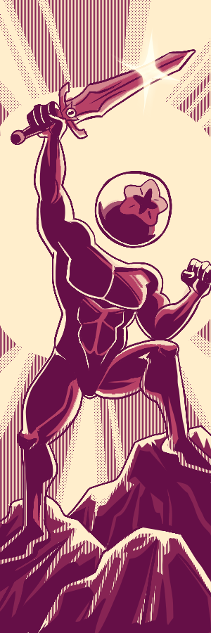
The artwork was stunning, although I think at least several panels would've looked better without the "sketch" underneath. The colored page is particularly haunting and at the very least stunning. It did a great job of conveying just how horrifying and ruthless Gilgrad is.
The gore, oh man the gore is top notch. I love a character getting bloodier and bloodier as the comic goes on, and you truly made the most out of the obligation to kill your opponent.
I love the end section. A proper conclusion, a succint explanation, and a proper aftermath of the event. And to make it even better, directly afterwards you made me realize just how badly underused bloopers and post-comic sections are!
My one grip with it is the art though. Although a satisfying and fun comic to read, I feel the art was quite rough around the edges. Part of it is due to what I can only presume is you running out of time (particularly the sketched mid-section)
Overall it was a well executed James Bond type action comic, and I'd be curious to follow how it would further develop.
Off that bat, that Page 3 is really great. Big, Bold and just in your face ferocity. Really establishes the intensity of the character. You also have some really fun action and I love that you aren't afraid to just dive in and go full ham on your battles sequences.
With that being said though, I think a little bit more consistency through out your pages would have been beneficial. Some pages I think could have used more time to be worked on to help with some of the clarity of what was happening, there were a few panels and pages throughout that I wasnt fully sure what was happening or where the characters were located.
Still a good entry and I look forward to reading more from you dude! Gimmie that ACTION.
First of all, I think you have some really neat sci fi concepts that can be a whole lot of fun! there was a lot to unpack in here and I think you've got some cool ideas!
I think you may be in a similar case to your opponent where I think I'd have like to see a bit more finished line work throughout, as some of the unfinished pages made it a little hard to establish what was going on. Using a little bit more focus on the visuals to establish what was going on instead of text. Also sticking to similar font choices I think may be helpful as well to help keep everything tied together.
I still had fun, and I look forward to seeing more from you!
Lovely compositional work. You do such a nice job of adding flow and movement to your paneling and figures that coincide with the direction American comics are read. Your storytelling is also a nicely packaged beginning middle and end. No fuss no muss and often that's really all a reader wants! I think if I had one note it'd be to tighten your inkwork. what you may considerhyper detailing may simply be too busy and makes for scratchy inks and less defined moments panel to panel. The adage that les is more may be something to adhere to in your next comic. Still all in all, some great expressions are had here that I'd excitedly encourage you to push more. Some of the looks given that're battered bleeding and earnest in this comic really grabbed me.
Very nice splash pages in this, especially on page 7, but I would definitely recommend pushing what's established with some SFX and atmospheric effects. Really give us the full weight and impact of a craft that size.
I know that a post credit page with yuks is a fun extra to have, but extras, by definition are goodies you have the time to include because your comics is done and you have the wealth of time. It may be beneficial to reassess your workload and stories so you have the means to deliver a complete work with the time allotted. Sometimes a shorter story that's polished and finished wins out over an epic tale that isnt done!
I know time got the best of you, but I think your comic still works, even mostly without words! The first time I read it, I had a hard time knowing what was going on, but once your first page was fixed, that was enough context to go off of. I do wish we could have gotten a little more narration so we knew things like who the guy with the eye patch is (I'm guessing the doctor that runs the experiments? Or like, #27's handler?), but that's those short deadlines.Your art was definitely still rough in some parts, and a bit hard to tell what was happening, but some of your action shots and paneling are really cool! #27's entrance is appropriately spooky and badass, it's obvious you had fun working on that page. The back and forth of the action on that next page is great too, that shot of Sirius jumping forward and shooting is so dynamic. And Sirius's death is just, *so* brutal! That poor sweet cat man! Those last two pages didn't need any words, it was a cool way to sort of display #27's thought process, and showing how he can't really help the monster he's become. Good stuff!
I love that you both are the only two that actually tried to tie "Black Diamond" into your narrative! It's cool having an overarching element like that. The tight deadlines got to us all, but I think your comic still works pretty well, even with the rougher parts! That last page that got added in from the first upload was a good cap on it, too. Showing that #27's mind was still there enough to take down the jerks that did that to him. Sirius is a cool cat (hehe), and of some of the people in this tournament, I think he's one of the ones that could take on a beast like #27, and the way he dispatched him was cool! I will say there were some bits I didn't quite understand what was happening, but that may have been a time issue more than anything else. Some spots like the last panel on page 3 kind of confused me, I just wasn't sure what I was looking at. Page 7 with the chunks of #27 falling into the abyss really worked though! I think some of your pages could use just a bit more clarity, but it is hard to make sure everything is clear on such a tight turnaround. Either way I think you should be proud of your comic, looking forward to more from you! :>
Xeno - Wow this was such an ambitious comic. Love the use of the scrolling effect in some of the pages here. And damn, that page 3 was RED hot. Talk about an entrance. You really sold the dread and threatening aura of Gilgard there.As for the crits, perhaps you can try experimenting with using a different font for your text (Back Issues font, Milk Mustache are popular recommendations) because the one you used for this comic made the words look a bit more crowded for lack of a better term. I understand that the time constraints had prevented you from having a polished and complete comic in this case but if that page 3 was any indication, I can only imagine what you could produce if you had all the time in the world.
The kill scene was brutal and ruthless. You really made Gilgard a force to be reckoned with.
Johann - I love how we dove right into the action immediately. One of my fave parts was that establishing shot in the first page, just showing us the scale of this space shuttle in relation to the snow-capped mountains in the background. The narration made me feel like I am right there as well. Like your opponent, it seems that the deadline also prevented you from finishing the comic in its entirety (understandable as I don't think I'll be able to do the same given the content you wanted to show). I think it couldn't hurt to plan for a shorter comic next time for better time management. There's this saying "show don't tell". Right now a lot of the things that are happening were described via text. While that can work, if the accompanying art that supports it is unfinished, it kind of detracts from the story IMO. But I am sure with lots of practice and giving yourself manageable goals in the timeframe that of your choosing, you'll find that it's easier to finish comics and you'll eventually be faster as well!
Really love the space horror feel of this comic. The gruesome violence and scariness levels are off the charts! The art is nice, the deadline was super tight so don't worry that it's sketchy and unfinished. I think you might want to try and be more economical with your details and put more into panels that are more splashy. Both these characters are pretty highly detailed so getting a bit more shorthand might save you time. I'm sure everyone is saying the same thing but that full color splash page is SO effective at selling the imposing, terrifying entrance of your character.
My main critique is that the lore stuff in the beginning is a bit wordy and the reading order is not always clear. I would recommend trying to slice down some of the dialogue, you can definitely convey a lot of stuff through just visuals like you did in the second part of the comic! It can definitely help to get a friend to edit as a second pair of eyes will be able to sort through which parts are more necessary. I also kinda wish you had one more page showing something of the aftermath, just a simple wide shot even of Mr. Subject holding the head would help it feel more final.
I also really like how you work with perspective and dynamic posing, every panel feels new and interesting and full of life. This was such an atmospheric comic that did so well at selling the mood and seeing it through!
This is a fun comic that really feels a snapshot of part of an expansive world, there are so many things that are sort of left dangling, the politics and the technology, it feels so alive and interesting.
It's unfortunate that you didn't get to finish the artwork, as the parts that are more finished are pretty nice to look at, they have a minimalist feel that I really like. I honestly had a bit of a hard time parsing what's happening in the middle of the comic so I'm not entirely sure I can comment on the story super well, but I like how you build up your opponent's character through the aftermath of the fight, it gives a lot of tension before he's introduced.
I hope you keep making stuff cause I really like the Vibe of this comic, it'd be really cool to see what you can do if you have more time.


johannhawk
💉🗺️🌌
Comment posted: February 12th, 2023 at 7:47 PM