
Voting is closed.

Wolkemesser
I am, first off, impressed with the lean page count of this comic. While being short isn't nesc. an objective virtue, I love how much you both made happen in only 8 pages.
Throwing your characters headfirst into such a tense and difficult-to-read situation was a great choice - I appreciate how, even after re-reading the comic, there's really no-way to tell at this point whether MFD or Lenard was in the right. MFD presents as more rational, seeming willing to go along with Effi's suggestion, but its reasoning for doing so is so calculated, and its determination to terminate Lenard to that point so unflinching, that I question its trustworthiness.
On the other side, Lenard, while he seems fully sincere in his innocence, is so panicked and acting so (humanly) erratic. There's nothing firm to grab on to, and that feels like the point. The horror here is the senselessness of the violence, and that it seems at once both fully avoidable and inevitable.
This comic has the best compositions of the first round, in my opinion - the opening shot of the space station gliding along the ring, makes for a stellar (eheh) initial visual, and the shot of everyone getting sucked out through the shattered dock window was gorgeous, both in how you've played with the angle of the shot, and because of the beautifully rendered dock interior and spacescape beyond.
(speaking of the spacescape, I like how, by contrast, the final panel shows the space beyond the dock as pitch black, to underscore the deadliness/bleakness/etc of it all.)
AWESOME stuff, and a terrific read. give yourselves a well-deserved pat on the back!
PS - was the black hole on the cover supposed to look like the Edge of Eternities set symbol? Love the design either way, I just had to ask ;)
Wolkemesser
WOW! I really enjoyed this comic, and my enjoyment of it has only grown on subsequent read-throughs.
MFD is genuinely unsettling, and your depiction of it in this comic felt to me the most true to a horror movie character out of any in the tournament so far. The whiplash from chummy and supportive to corporate jargon-spouting terminator was effectively unsettling, and the absolute lack of any empathy at its core adds so much to the story.
The power that MFD clearly has over Lenard is striking as well - part of that does seem to be Lenard's own feebleness of character - he does, after all, willingly go ahead with programming Effi to try and kill Mopaz, but the comic gives you the feeling that MFD's ability to manipulate Lenard is something far more calculated and long-running, with how quickly Lenard starts to doubt the evidence of his own eyes, in a double murder that he was complicit in.
Side note - perhaps my favorite little detail in the entire comic was MFD deliberately re-iterating that Mopaz attacked Lenard, despite the actual events of the last few moments.
Mopaz' transformation was an unexpected twist, but I love how you depicted it. The introduction of a suddenly wider color palette really sells that whatever is happening to her transcends the sci-fi-horror grounding of the comic, and the fact that she is still killed so ruthlessly regardless makes that horror grounding feel inescapable, as it ought to feel in a truly scary story. In a similar manner, that the relentlessly cheery Effi gets so quickly used and disposed of for some vague corporate agenda makes the situation of the character's feel inescapable.
Absolutely stellar first round comic, y'all - I'm immediately enthralled with this pair of characters, and I see you making strong use of your opponent's as well.

PyrasTerran
This is a compliment: From the first panels, my head suddenly started filling with Jerry Goldsmith's music from Alien, and memories of first entering Sevastopol Station helped set the mood perfectly.
Honestly there's so much in this comic that is done just right that it's difficult to find places of focus for future comics that you guys aren't probably already aware of. There is one thing I noticed in pages 6-8: If I am understanding it correctly, the surprise is supposed to be that what looks like a window showing space is actually just painted on and when it breaks it reveals the black hole waiting outside? There are some panels where this isn't clear, whether it's an oversight or what, it left me having to check back and see if I was looking at things right or not.
That aside you've built an interesting world and have strong comic fundamentals all around shown across this round, great first showing!
PyrasTerran
It seems like time was an obstacle for y'all so I won't go into the unfinished elements you are likely aware of. Off the bat I want to recognize the strong script you have, especially the building of fear and dread with your two characters, of your own colleague being the one to fear. There was a nail-biting tension to it and I was really engaged thinking about where this relationship would lead in future rounds. So bravo with that
I'm a stickler for strong lettering/word balloon skills as others may attest of my reviews so I'll be repeating that gospel here as well: you will benefit from a stronger font choice and more intentioned tails and connectors for your balloons, but you do have a good instinct about breaking your word walls into smaller more digestible bits so that's a big plus
keep on rockin'
tictoc64
The work that's gone in here isn't going unnoticed! I think the art direction is fantastic in this comic and I find myself just going back to appreciate pages aesthetically. Though it was on the shorter side (comparatively) I feel it communicated its story really well and I enjoyed seeing all the characters interacting. You did a fantastic job portraying everyone and giving them their chance to be in the spotlight which I always appreciate. I feel like my only criticism is the conflict is very abrupt but I can't blame you given the length of the comic.
tictoc64
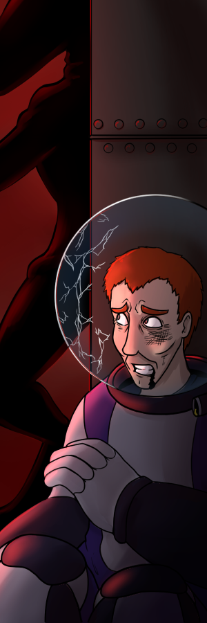
This was a great comic! I was really engaged in the narrative and really felt the emotion of the guilt Leonard was going through. What's amazing is seeing how cowardly he is from the start and then by the end feeling very sympathetic to his awful situation, honestly fantastic character writing! MFD makes a great foil to Leonard too, truly a terrifying corporate drone. I always give props when it feels like the opponents characters got their dues and you definitely wrote them in a way that gave them their chance to stand out on their own. I am giving a bit of a lower score for a lot of the pages being the greyscale sketches, however the writing more than carries it here for me, and it's clear you know when to really flex the artistic muscle. Great work!
Gravelyhomes23
To start, I really liked the style of the station and the focus you put on the black hole. Its a really interesting design choice/looming threat. I also like how it immediately jumps into the action while still leaving a bit of time to characterize Effie and Mopaz. I do wish I could see a bit more Mopaz characterization, but its good either way. I really like your panel set ups, they were very easy to read and when characters broke the panels it added a lot of emphasis. I also like how short this was, it does what it needs to and wraps up the story quickly. It could almost be a stand alone comic, but still has room for potential continuations.
Gravelyhomes23
I want to start out and say I love the station design and how technical it all is. It is a shame to loose the background details the farther into the comic, but to be expected with a deadline. The art itself is great and adapts well to the greyscale. Additionally, it works really well when the background color is changed from grey to another color to up the tension. The only criticisms I have on that there are minor textual mistakes (missing a word, corp corp instead of corpo corp) and coloring mistakes, but overall this is a good comic.

sunilill
It's a very short and sweet comic, but very well done. You clearly used the time to work on the artwork (especially the backgrounds), and it paid off.
Overall, I wish you fleshed out the characterization of your opponents a little more. Once again, I understand it's a short comic and there were only 3 weeks, but just personally it feels like there could have been a tad bit more of an explanation about what happened. I also might be being a little nit picky.
Overall composition of the panels worked really well, very visually pleasing and easy to understand. I really adore the first page, the establishing shot the way the text flows was done really really well.
sunilill
23 pages is a lot for a 3 week comic, but you managed to complete it and that is an accomplishment in of itself. The length also allowed you to spend more time on the characterization of your characters as well as your opponents, which I appreciate.
While I understand it was due to the time crunch, the change from colour to black and white was a little jarring, and the use of colour felt inconsistent. I feel like when it comes to cases like these, I feel like it's overall better to be consistent. Therefore I would've kept the whole comic in black and white (with the coloured back drops), which maybe would've allowed you to also add in some cell shading for all the panels as well.
That being said, the colour and lighting for the first couple panels is really strong, I understand why you wanted to keep that quality for the rest of the comic. I appreciate the subtle rim light on the characters for page 2. As well as the colour shift to red for page 7 was a good choice, and I would keep that in even if you changed it to grayscale.

Piñata
I gotta tell ya, I love love your background and environment work. The floor to ceiling windows of the craft boasting a fantastic backdrop of colorful space was VERY smart. It's great to see Ninja's signature colors mingled with some high detail inks. It makes for a really fun marriage of style. There are some rad creative choices in your paneling that is subtle, but in a way that draws the eye from elements poking out of frame or the tilt of big events to a dutch angle. It really gives that extra little oomph to the big story beats I think you're trying to hit. I also appreciate that you paired them with equally creative lookin font for your SFX. I love seeing artists I wouldn't normally see paired together making magic, which I think was achieved here.
I and I think many reading this will be surprised by the short page count managing to pack quite a story punch. That's such a great economic use of your time to ensure the pages you DO have looks sharp as heck. Great showing all around.
Piñata
While 23 pages is a wild and impressive amount for a tournament of this length, I think the sheer volume took a toll on your page quality and environment building. We lose your lovely colors and the ship, which I think is a great character in itself, especially in the moments Lenard is fiddling with the terminal console which I think could've been more bombastic considering how relevant it was to the story.
Needless to say, I really enjoyed your word bubble flow. It really guided the eye panel to panel on where to go, even when that dialogue broke the confines of the paneling page to page. It's also clear you had fun oscillating between MFD's amenable demeanor to the detached and chilling HAL 9000 directives. I love that this is but the first piece on the house of cards that's inevitably going to come crashing down to their inevitable confrontation.

Pizza Man
Ooh boy I really enjoyed this one! I was surprised when I went back to read it again that the comic was only 8 pages it felt a lot longer in a good way! I love how you unitized each character. While we aren't really introduced to the situation the escalation of the conflict felt real and while we didn't get answers on why Lenard was accused I believe that the conflict will come back to haunt our protagonists should the comic continue. Great work on the art, I love the first and last panels of the comic the most and I choose to believe that was intentional!
Pizza Man
I liked y'all's approach when it came to the paranoia aspect of the tournament. This was an ambitious comic you created with 23 pages! The story was pretty intriguing, splitting up your party was a neat choice though oddly enough the interactions felt a bit sidelined. I don't really get a feel for anyone's personalities in a way where I want to see how they'll react to the situation at hand. That doesn't mean I didn't like the dialogue though, it really helped set the stage for a thriller in space and I'm invested in where it could go!